Safeway Kiosk Redesign

Improving efficiency of Safeway Self Checkout kiosk so more users can be comfortable with using it.
Timeline: 2 months
Role: Product Designer
Team: 3 students
Module creation img

PROBLEMS

Problems

Safeway self-checkout kiosks allow customers to scan, bag, and pay for their groceries without assistance from a cashier. While these kiosks aim to streamline the checkout process, users often face challenges such as scanning errors, unclear payment steps, and usability issues that lead to frustration and delays. The goal of this redesign was to enhance the self-checkout experience by addressing these pain points, improving efficiency, and making the interface more intuitive for users of all backgrounds. The following are the three main problems that we aimed to solve

1. Overwhelming number of search options

  • If the name is "Potato Russet", typing "russet" does not show the Potato russet. The names need to remembered as is by the users to search for them
  • There are 3 types of search options on the home screen which is overwhelming and confusing

2. Unclear feedback on discount addition

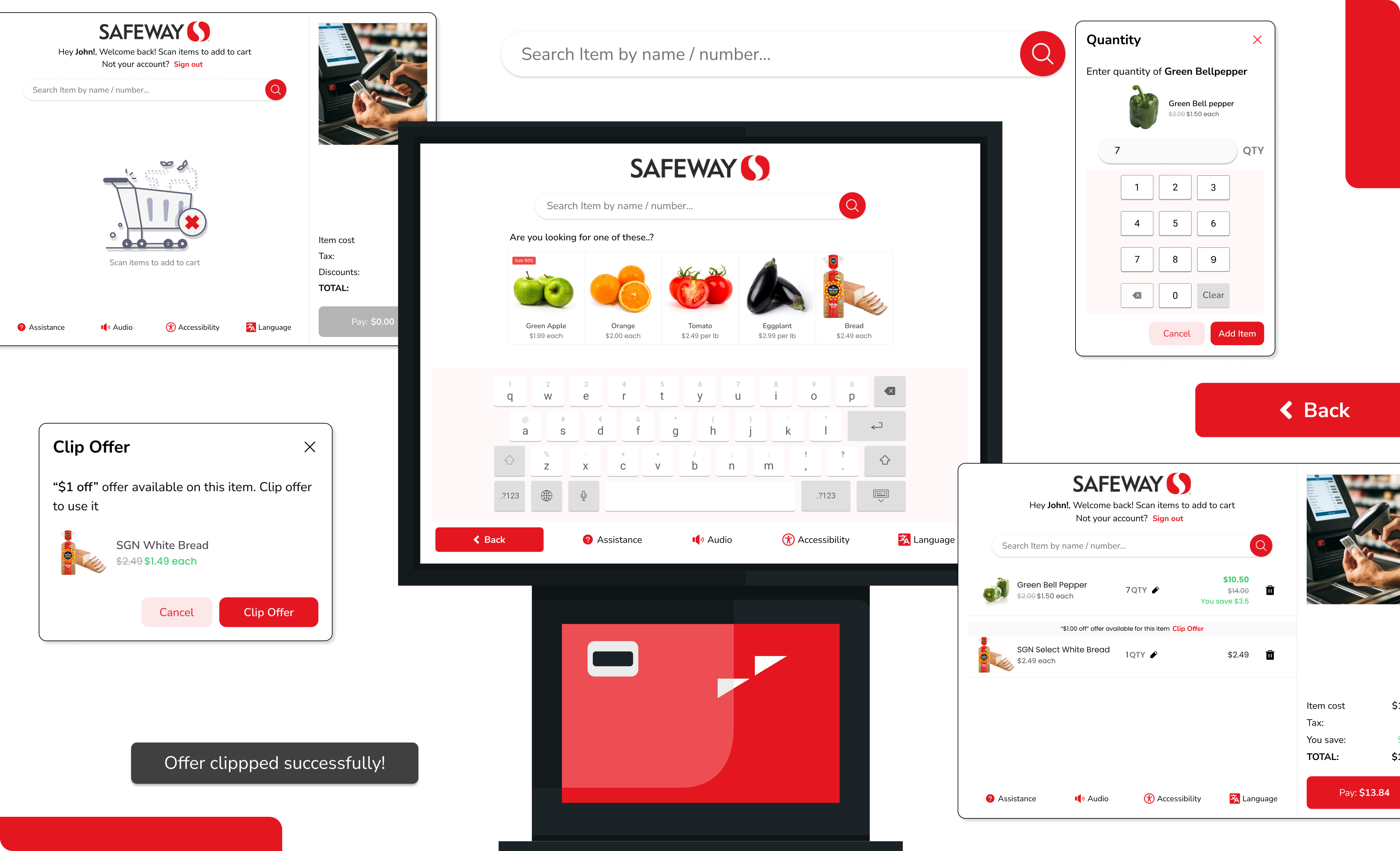
To add discount, user have to scan discount barcodes in the isle or add them from the app before going to the counter

  • Discounts for items are not easily discoverable and can only be added if checked/scanned on the app
  • In the bill, the voided items and discounted items have very similar designs making it unclear if discount was added (See image)

3. Lack of brand consistency

  • Lacks consistency in its layout throughout the checkout process, with each screen displaying a different style. This inconsistency disrupts user flow and adds unnecessary complexity to the experience.
  • It fails to adhere to Safeway's brand guidelines where red is a key colour for brand identification. As a result, users may encounter difficulty in recognizing the kiosk as an extension of the Safeway brand, leading to potential confusion and diminished brand perception.

SOLUTIONS

Solutions and Wireframes

1. Familiar search bar

The animation on the side guides users in scanning items, and a familiar search bar allows barcode-free searches. Since produce names can be hard to recall, even for frequent users, the search results provide more details and relative products!

2. Audio Cues to add membership

First time users were confused by the audio cue in the kiosk saying "Add your club card details". The kiosk announces "Add your membership detail by scanning your membership code or entering phone number".

3. Intuitive discount addition

Increased visibility of discounts by showing them on the kiosk. Additionally, the savings and discounts are visually different from the other offers which reduce confusion during payment.

Success of Redesign

RESEARCH METHODS USED

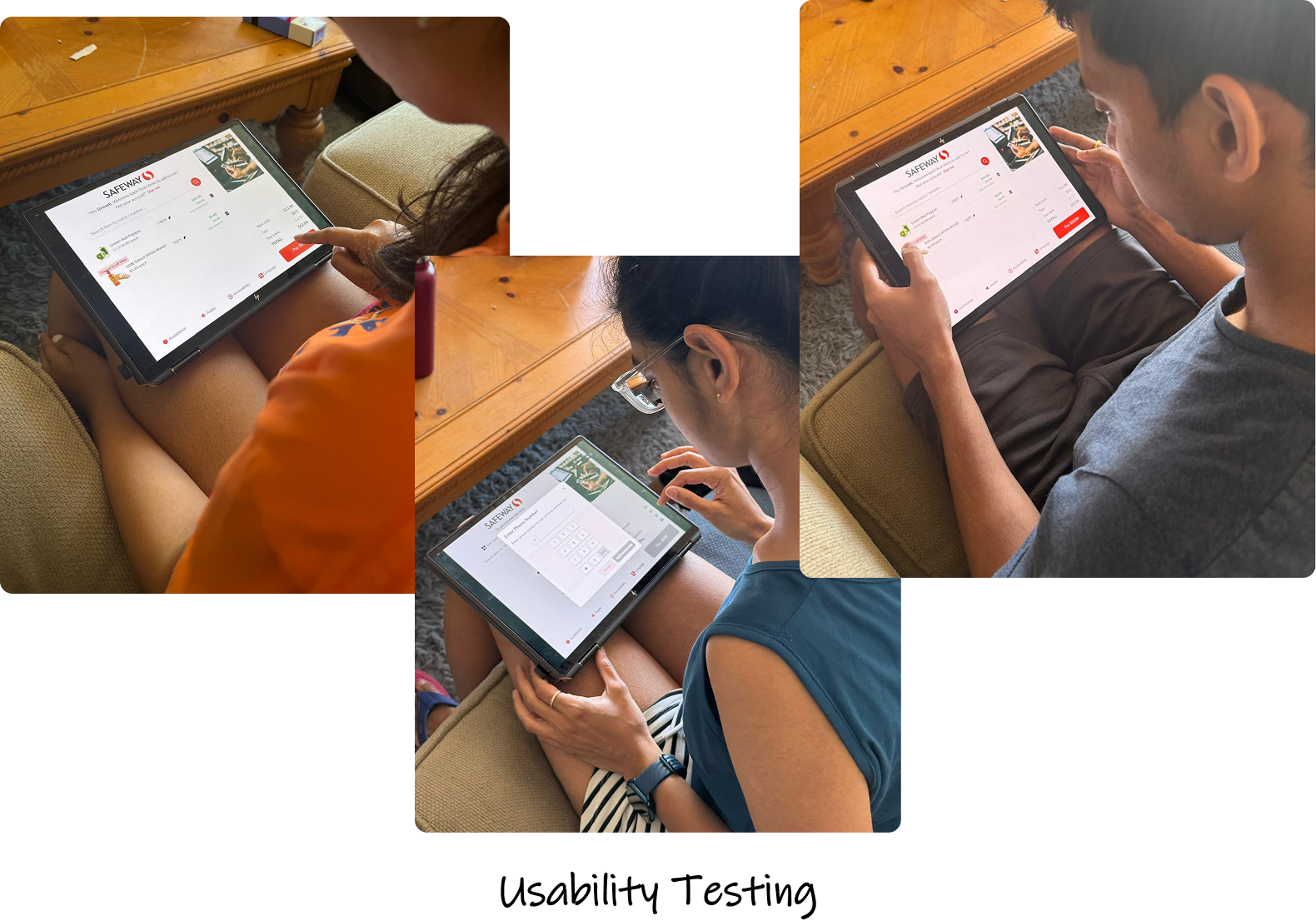
Usability testing was conducted on all three types of users and the time efficiency increased by 60%. The environmental conditions were not very similar to Safeway checkout areas, but users understood the new UI, flow, and interactions much better, reducing the confusion.

USABILITY TESTING

TASK
OLD DESIGN
(avg time taken in sec)
NEW DESIGN
(avg time taken in sec)
Adding Membership
25 sec
13 sec
Adding 7 green bell pepper
60 sec
16 sec
Adding bread to cart
10 sec
9 sec
Payment
10 sec
10 sec
TOTAL TIME TAKEN
1 min 45 sec
48 sec

Research Methods Used

RESEARCH METHODS USED

1. Heuristic Evaluation

We assessed the system's performance using Jakob Nielsen’s ten heuristics and a severity rating scale of 0 to 4. The problems shown above are a few that were uncovered during this evaluation.

2. Cognitive Task Analysis

A cognitive task analysis was performed where we provided a task to the user - Add you club card details and buy a red bell pepper. The following were monitored in every step of the task

  • Equipments / Materials needed
  • Decisions that users have to take
  • Perceptual cues present for users
  • Previous knowleged required of the user
  • Situational Assesment

3. User Personas

Based on our user interviews and observations, we meticulously crafted three distinct personas to encompass a wide range of user perspectives and behaviors: the Frequent User, the Occasional User, and the Rare User.

4. User Journey Map

In creating our journey map, we focused on the experiences of the frequent Safeway users. We delved into their thoughts, actions, pain points, and emotions at each touchpoint, aiming to get a deep understanding of their experience from start to finish. This journey map serves as a valuable tool for analyzing user interactions, identifying pain points, and ultimately enhancing the user experience to better meet the needs of our diverse user base.

Other Projects